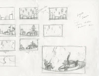
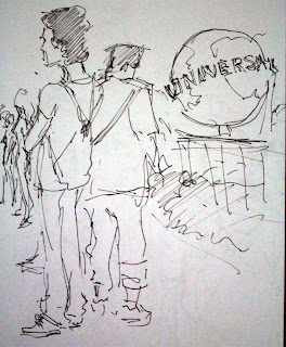
I recently bought this great new watercolor set so i tried it out a bit. Did some outdoor studies with it and I'm getting the hang of it. I've also been influenced by Chris Sanders(director, writer and character designer: lilo & stitch, how to train your dragon, the croods) in the way he designs characters/creatures and uses color. I did a few things like that that didn't turn out too bad.
Tuesday, December 25, 2012
Monday, December 24, 2012
End of 1st semester
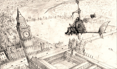
Forgot to post these up. These were my final projects for perspective and 2d design classes.
Perspective- "sky is falling": A city in 3 point perspective and an object of some sort obliquely falling from the sky.
2D design-"Unity": Diptych of a greyscale abstract image and a colored representational image derived from the basic design of the first. the composition has to show everything we learned in the semester.
And with that, the 1st semester at Ringling ends.It was amazing. My final GPA came out to be pretty good too.
Tuesday, December 4, 2012
Sunday, November 18, 2012
2D design project#7
This project is all about rhythm. The assignment was to create a composition with 3 distinct progressive rhythms. As you will notice, my rhythms are the swirly pattern, the music conductor figures and the wondrous light thingies. In addition to that, we were supposed to use a triadic color scheme. The canvas size and medium was our choice. So I chose to use acrylic paint on bristol board paper appx. 9*12 inches.
My idea was to use music to create the composition and hopefully, you get the feeling of music from looking at it. Here is the piece and below that is the concept work leading up to it.
Monday, November 12, 2012
2D project #6
This project was based on observation; namely, photography.
We were supped to take around 300 pictures of analogous color schemed things around us, and submit 3 best out it for the final grade
For those of you who don't know, analogous colors are colors present next to each other on the color wheel. grading is based on the colors and composition.
Thursday, November 8, 2012
Tuesday, October 30, 2012
2D project #5
This time we were supposed to create 4 compositions that alter the narrative by using the same elements(silhouettes) and change the emphasis point in each composition. each composition must show emphasis through 1.value 2. direction 3. proximity 4. color. One composition for each of these.
I thought I'd show my design process this time. from top to bottom, my earliest versions to the final one.
Sunday, October 28, 2012
Tuesday, October 16, 2012
Sunday, October 14, 2012
Tuesday, October 9, 2012
Subscribe to:
Comments (Atom)


